Orchid Pig
Orchard Pig is opening its first restaurant in Australia the heart of the Margaret River wine region. As an international cider brand competing against well-loved home-grown cideries, it will endeavour to establish itself as a reputable brand.
They have built a cidery with a restaurant, bar and shop, where customers can sample their ciders alongside locally sourced food. We needed to create a modern full-stack website for Orchard Pig to promote their newly established cidery in Margret River
They have built a cidery with a restaurant, bar and shop, where customers can sample their ciders alongside locally sourced food. We needed to create a modern full-stack website for Orchard Pig to promote their newly established cidery in Margret River
Scope
UX Designer/Engineer (me), 1 x UX Designer, 2 x Developers
Team
- Create responsive designs in Figma and code for a seamless user experience across various devices and screen sizes
- Develop and manage the website with a MERN stack utilising AWS
- Optimize apps for speed, scalability, and compatibility on multiple platforms
- Conduct regular code reviews and provide constructive feedback to enhance code quality and knowledge sharing
- Engage in the entire software development process, from concept to testing, deployment, and maintenance
- Troubleshoot and resolve bugs promptly
- Collaborate with the other UX Designer to ensure the feasibility of UI/UX designs and contribute innovative ideas for user experience improvement
Responsibilities
- Ensure the website is intuitive, easy to navigate, and visually appealing to all user demographic
- Ensure that the website accurately represents the cidery’s brand, using consistent logos, colours, and typography
- Integrate inventory management to keep track of product availability and sales
- Ensure user data is securely stored and transmitted
Goals
How do you make a 150 year old cider company look cool to young adults?
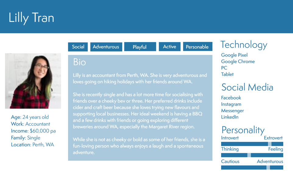
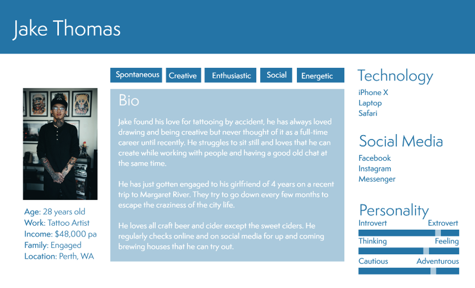
Orchard Pig wanted to target mischief makers with a thirst for the new and exciting between 20 and 35 years old. This group of young adults are open-minded, adventurous, fun-loving, social and mischievous. They are looking for a great-tasting product with character that's not like other sweeter mass-produced ciders.
I researched this demographic with my team, starting with qualitative research methods of interviews and focus group discussions. This was a great way to capture the personal experiences, preferences, and pain points of our demographic concerning cider consumption. We then transitioned into quantitative research and created a series of surveys distributed across diverse platforms frequented by young adults. We asked questions about flavour preferences, purchasing behaviour, and brand loyalty.
Leveraging the insights from our research, we synthesised the qualitative and quantitative data to gather insight, identify patterns and create a persona to embody the behaviours, preferences, and pain points of the target audience. We created 3 personas, are these became an important tool in our UX design process.

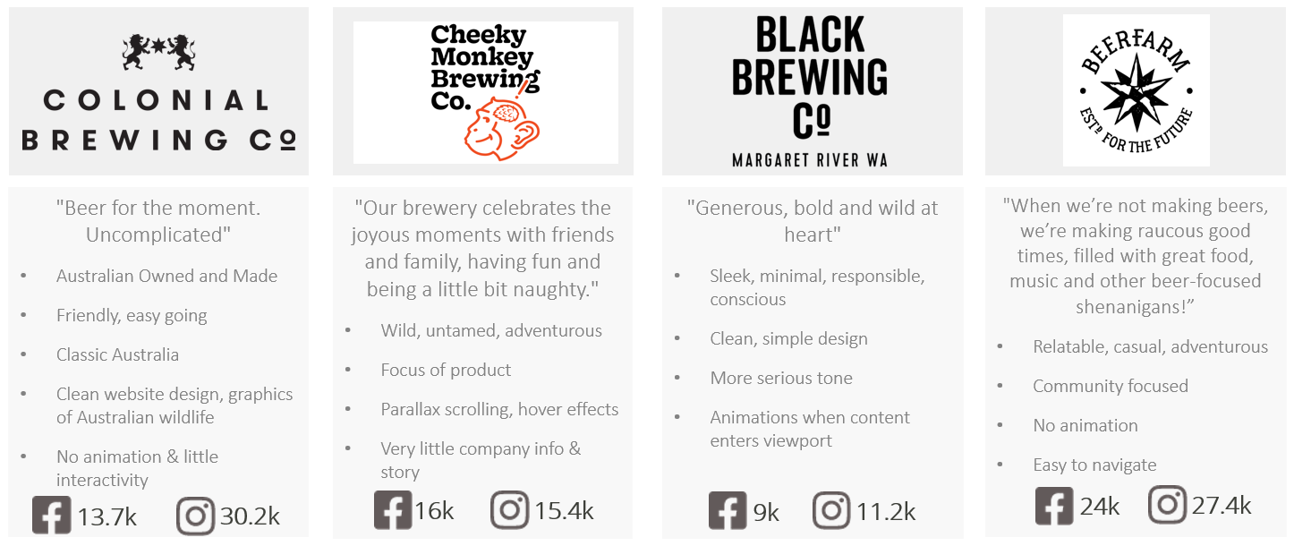
We then needed to know more about the competition
Undertaking a competitor analysis is important to understand not only those who offer similar products or services but also those who might fulfil the same user needs through alternate means. The analysis of these competitors involves an evaluation of their digital presence, specifically focusing on their websites and mobile applications. We were able to identify areas of opportunity, potential pitfalls to avoid, and an understanding of what is a good user experience within the existing market.
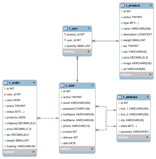
Front-end information architecture and database schema
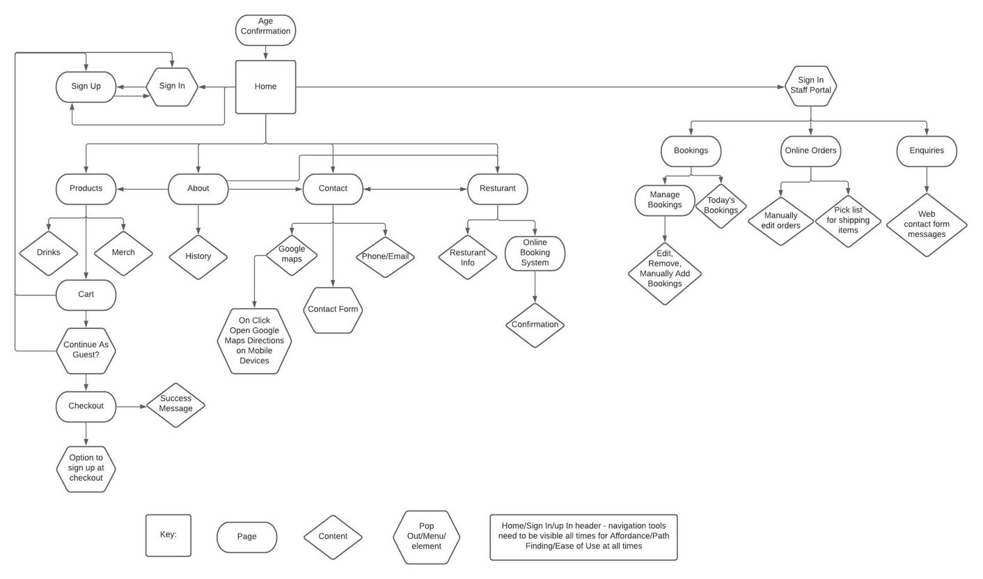
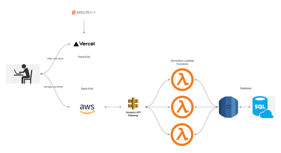
I collaborated with the two developers in my team to map out the front-end information architecture (IA) and user flows. IA illustrates the organization of information and page connectivity, while the data schema map shows how create users login and how users will purchase items from the shop
We then moved onto interface design (my favourite part!)
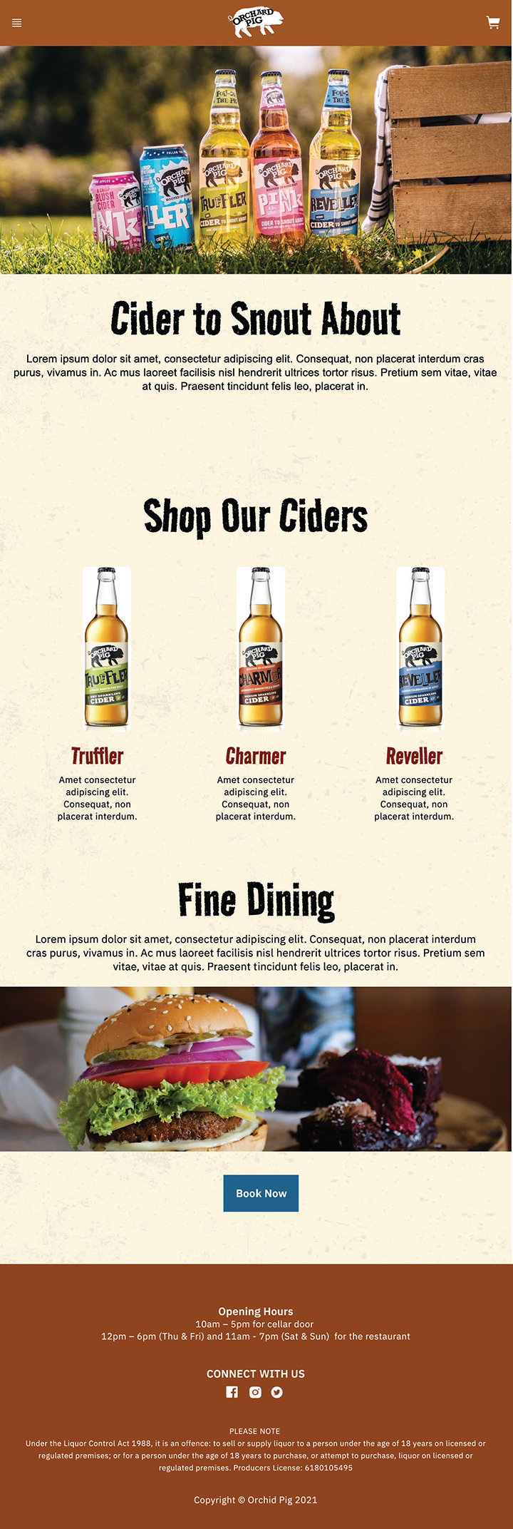
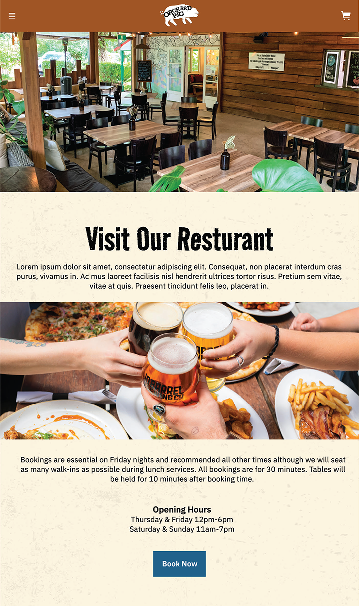
Transitioning into the interface design phase, our team adopted IBM's Carbon Design System for our UI design and coding practices, utilizing its cohesive guidelines, robust components, and user-tested design resources. This approach not only facilitated a seamless and coherent user experience but also assured a consistent and visually appealing website. By leveraging a renowned design system, we ensured an intuitive, reliable, and user-friendly interface, aligning closely with user expectations and brand ethos.


I then had to overcome my biggest challenge: coding frustrations
Although my proficiency in coding, especially in JavaScript, has not historically been my strongest skill in design, embracing Svelte has been a transformative experience due to its intuitive nature and logical framework, resonating with me more significantly than other frameworks.
I also ventured into using Git, cautiously navigating through pushing updates to testing branches and gradually becoming adept at version control. Collaboration with the web development team illuminated the practical nuances of implementing Figma designs into code, teaching me the value of flexibility and adaptability in ensuring the feasibility and usability of the final digital product.
I also ventured into using Git, cautiously navigating through pushing updates to testing branches and gradually becoming adept at version control. Collaboration with the web development team illuminated the practical nuances of implementing Figma designs into code, teaching me the value of flexibility and adaptability in ensuring the feasibility and usability of the final digital product.
Want to see the finished product?
- Amplifying online presence through a responsive website that lead to better search engine rankings and reaching a wider audience
- Ensuring that customers have the convenience to explore and purchase products at any time boosting sales opportunities.
- Implementing an easy and straightforward checkout process that is as simple which reduces cart abandonment and enhances user experience
- Enabling more interactive and engaging content tailored for various screen sizes
Results and
Achievements
Achievements
I found myself not only immersed in crafting a user-centric design but I was able to venture into the dynamic and complex world of coding to bring our collective vision to life. The collaborative spirit of the team provided a supportive environment, enabling me to explore and acquire new technical skills in coding, thereby elevating the functionality and interactivity of the website.
Conclusion
