Sunrise Design System
Over the years, the business reduced the team size and budget of the design system team. With no resources allocated to keeping the Figma library up to date with their React counterparts, the design system quickly became out of date.
I was tasked with updating, maintaining and optimizing the Sunrise Design System, which included the Sunrise Figma component library and the Sunrise documentation website on Zeroheight
I was tasked with updating, maintaining and optimizing the Sunrise Design System, which included the Sunrise Figma component library and the Sunrise documentation website on Zeroheight
Scope
Design System Designer (me), 2 x Senior Developers and a Product Manager
Team
- Create, update, and support design system foundations, components, and patterns in Figma design libraries
- Write and collaborate on documentation for design system foundations, components, and patterns
- Establish and drive design standards and principles accompanying the design system for scalability, efficiency, and consistency
- Evaluate and improve usability and accessibility of components, and be a champion for the user
- Occasionally conduct/participate in research that is relevant to building the design system
- Stay current with design and design system tools, best practices, and trends
- Support designers and engineers by providing clear feedback on design system usage, conventions, patterns, and best practices
- Uphold a high standard for design excellence, and contribute to raising the bar for design at Sunrise
- Enable product teams to make recommendations and contributions for new components and patterns as they emerge
- Support engineers as they create components by ensuring they’re built according to design and interaction specifications
- Work with our brand and marketing team to ensure brand vision is conveyed in the design system
- Champion the design to development handoff process
- Regularly communicate design system updates to the design team Senior Development Engineers and a Product Manager
Responsibilities
- Align all Sunrise Figma components to be identical to Sunrise React components
- Consolidate UX docs into one source of truth in Zeroheight
- Collaborate with teams to create a problem statement and generate actionable tasks from this statement so all teams are aligning on the work to be done
- Update all frameworks in preparation for React 18
- Continuously improve the design system
Goals
I was unprepared for the overwhelming number of things to fix in Sunrise
To grasp the enormity of the task ahead, I needed to step back and get a good understanding of the current state of the design system in Figma. After 3 weeks, I examined 1,562 Figma components, 98 React, and 89 Sitecore, finding varied branding and styling. Check out the file!
Key insights I gathered (click to expand):
Key insights I gathered (click to expand):
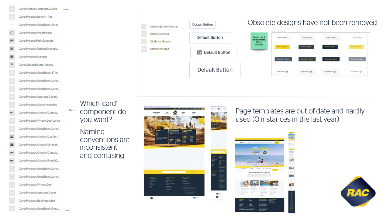
- The taxonomy of components is messy and not maintained to any standard
- Some components in Sunrise Figma are named the same but are different components
- Component names are too long and get truncated by Figma
- Component names don’t inform the user as to the usage of the component
- Some designer have not bothered to name their components. I found a component called ‘Frame 23244254253’
- Impossible to search for the right component by name in the Figma asset tab as incorrect and confusing naming makes it hard for users to find the component they need
- Difference in between React, Sitecore and Wordpress Figma components not clearly communicated to designers in Figma which makes it confusing for designers to understand which component fits the framework for their end product
- Figma components aren't mirrored 1:1 to their coded counterparts. Figma components will be slightly different from React components, resulting in variations in styling and element function
- There are no clear guidelines as to when a component created by a team should be added to Sunrise, which has resulted in snowflake components that are used by single team added to the design system ‘just in case’ other teams might need it in the future
- There are over 1000 components in the Figma library when on average only 138 Figma components are used per team per project
According to Lean Six Sigma, the 7 Wastes are Inventory, Motion, Over-Processing, Overproduction, Waiting, Transport, and Defects. Sunrise Figma has 4 wastes.
- Defects: Obsolete and deprecated components have not been removed from the Figma library, resulting in designers using faulty and out-of-date components
- Over production: Too many components makes for an inefficient use of time as designers struggle to find the right components
- Waiting: Process for contribution and usage documentation are not sufficient, which increases the wait time to get projects done as designers struggle to understand how to contribute and use components
- Extra processing: Meetings in multiple delivery and Sunrise teams on how to fix the problem means projects go over time
Design debt is the sum of all the imperfections in design processes that show up over time because of error, incompetence, innovation, and growth. Symptoms the design system is experiencing are:
- Focusing on feature releases without prioritizing design maintenance
- Users not converting to using the design system
- Designs are iterated without new data, feedback, or research
- Design elements and patterns are inconsistent
- New users are confused about how to use the design system
- Moving quickly at the cost of long-term quality (get it shipped, fix it later)
- Figma components do not reflect what the end user experiences. They are the ideal state that will be replicated in code as accurately as possible, within system and framework constraints
- The end user doesn’t experience a Figma prototype, they experience a full stack website/app
- Figma components are so out-of-sync with the end user experience that we need to rely on code to be our source of truth (for now)
I presented my findings report to our delivery teams, which included Product Managers, Business Analysis, Scrum Masters, Designers, Developers and Testers. People loved it and it helped Managers and Developers to better understand the struggles Designers faced when trying to make wireframes using the design system.
It wasn’t that the designers were slow and couldn’t keep up with the developers, it was the design system that was failing to support Designers to create designs easily. I felt a shift in everyone's thinking from ‘it’s this person/teams/managers fault for failing to make the design system work like it should’ to ‘the design system itself has failed us’.
It wasn’t that the designers were slow and couldn’t keep up with the developers, it was the design system that was failing to support Designers to create designs easily. I felt a shift in everyone's thinking from ‘it’s this person/teams/managers fault for failing to make the design system work like it should’ to ‘the design system itself has failed us’.
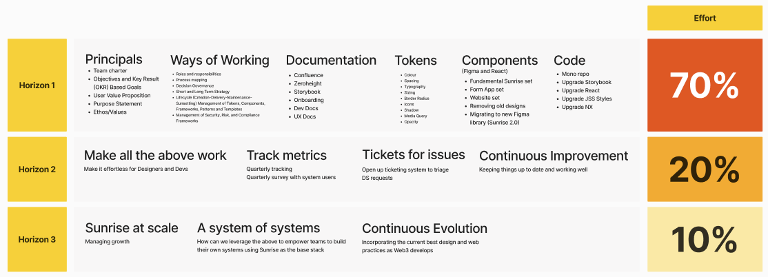
Redirecting the focus from individuals to systems created a newfound openness among the teams. Taking the initiative, I facilitated a workshop where the Sunrise and Delivery Teams collaboratively framed a problem statement. This shared vision served as the north star for the Sunrise Team, guiding our efforts and resources in addressing the problem statement
Mosaic delivery teams are unable to self serve or easily contribute to the DS or work through gaps with the DS Team because of these key factors;
This causes problems for:
Mosaic UX, Mosaic Dev, Mosaic Testers, Future Digital Delivery Teams, Sunrise and RAC
Because:
- WOW between Mosaic and the DS Team has not been defined
- The usage documentation and guidelines are either confusing or lacking for Mosaic UXers
- Inconsistencies across the Design System and RACI (styles and components) makes the source of truth confusing. Currently only 2% of compoments are consistent across all 6 platforms.
- There are multiple versions of components in React and Figma, some are not in use or have never been used. This has made figma cluttered which is causes confusion for designers (new and old). A recent audit uncovered that 64% of the components in figma are beng used less than 10 times a year and 370 of components are never used
- Process contributing to Sunrise is unclear and it's unclear when a component should be added to Surnise
This causes problems for:
Mosaic UX, Mosaic Dev, Mosaic Testers, Future Digital Delivery Teams, Sunrise and RAC
Because:
- Miss-alignment and variations are unintentionally created which creates tech and design debt and rework
- For the DS Team it also creates a large amount of maintenance tasks
- This is important because:
- Mosaic and the Design System Team is spending an avoidable amount of time and effort on working through these foundational issues
- It affects the onboarding experience of new Mosaic Designers , Developers and Testers
- It affects Mosaic's Delivery Teams' speed to deliver
- It affects RAC ability to easily scale up more delivery teams
- It contributes to creating inconsistent experiences and limits our ability to reuse (in dev and design) and move fast
In the insights from the findings report, I listed a series of recommended actions to resolve the issues raised. I checked these actions against the problem statement to ensure they were in line with our goals, got approval from the Product Owner to implement the actions, and created a backlog of Jira tickets for myself and the developers so we could start getting things done. These actions were focused on removing obsolete components and improving documentation for designers.
However, I needed to explore further with quantitative research
Having wrapped up the quantitative analysis, I shifted gears into qualitative research. Using Microsoft Forms, I dispatched a set of System Usability and Role Specific Surveys. While my prior research focus was on Sunrise Figma and UX Designers, I was keen learn more about the Developers' experience with Sunrise React. I was particularly curious about their usage of our design system documentation website rac.design
I meticulously organized the survey feedback in Dovetail, highlighted key comments and extracted insights, which culminated in a monster findings report. I plugged in the data from the surveys into Power BI and created compelling data visuals for my presentation.
The insights from the surveys were both validating and eye-opening, especially concerning developers engagement with Sunrise React. The biggest shock was that the Sunrise Design System's Usability Score was a big. fat. F
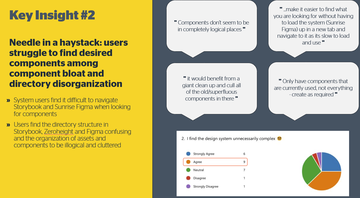
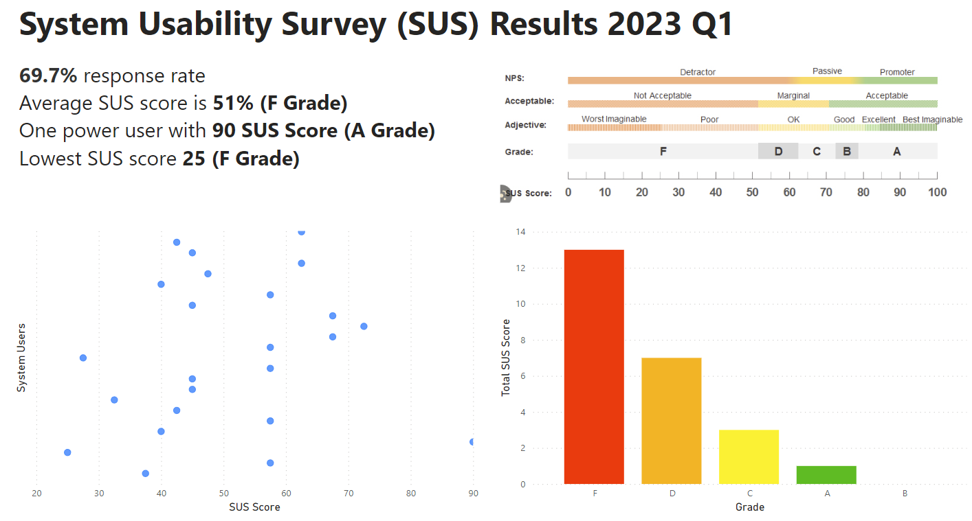
The SUS score for our Design System could've been a lot better, it was pretty embarrassing, but the feedback was clear: the design system was slowing the velocity of our delivery teams, forcing designers and developers to waste time working around the design system issues.
With clarity from the findings, I outlined a strategic plan for UX and Engineering based on actionable tasks from the findings report. To keep us heading in the right direction, I ensured each proposed action in the plan matched to the issues described in the problem statement created by Mosaic and Sunrise teams. After getting the green light from the Product Owner on the list of jobs to be done, I created a series of Jira tickets on our design system board. Top of our list? Bid farewell to redundant components in Figma.
It took 4 months of painstaking design reviews with myself and our RAC design system focus group to identify obsolete designs, weeks to archive these components carefully without breaking changes, and whole days where I was focused on creating new responsive Figma components that were mirror stacked to React components. I killed removed 64% of our components that were outdated and obsolete. This resulted in a leaner, fast-loading design system file that reduced cognitive load and confusion for designers and allowed them to work even faster.
Users were confused when navigate the poorly structured Sunrise Figma file
I may have removed a massive load of dead components from the design system, but the Sunrise Figma file was a mess. Over time, the Sunrise Figma file at RAC became a patchwork of styles and organizational methods, each unique to the designer who contributed to the system. I needed to create a new layout system for components that would link to components in Storybook and Sitecore.
I did several case studies of mature design systems (Shopify's Polaris is my fav) to study their design system Figma file structure, usability, legibility, and user-friendly experience.
Drawing inspiration from my research, I crafted a suite of utility pages that received enthusiastic approval from the design system Product Owner. Over the next few weeks, I updated the Sunrise Figma with this fresh design, and migration documentation to the design system documentation on Zeroheight. You can view the design system documentation I created for RAC on Zeroheight here
The new layout has helped system users find components up to 40% faster and reduced confusion when users navigate Sunrise Figma.
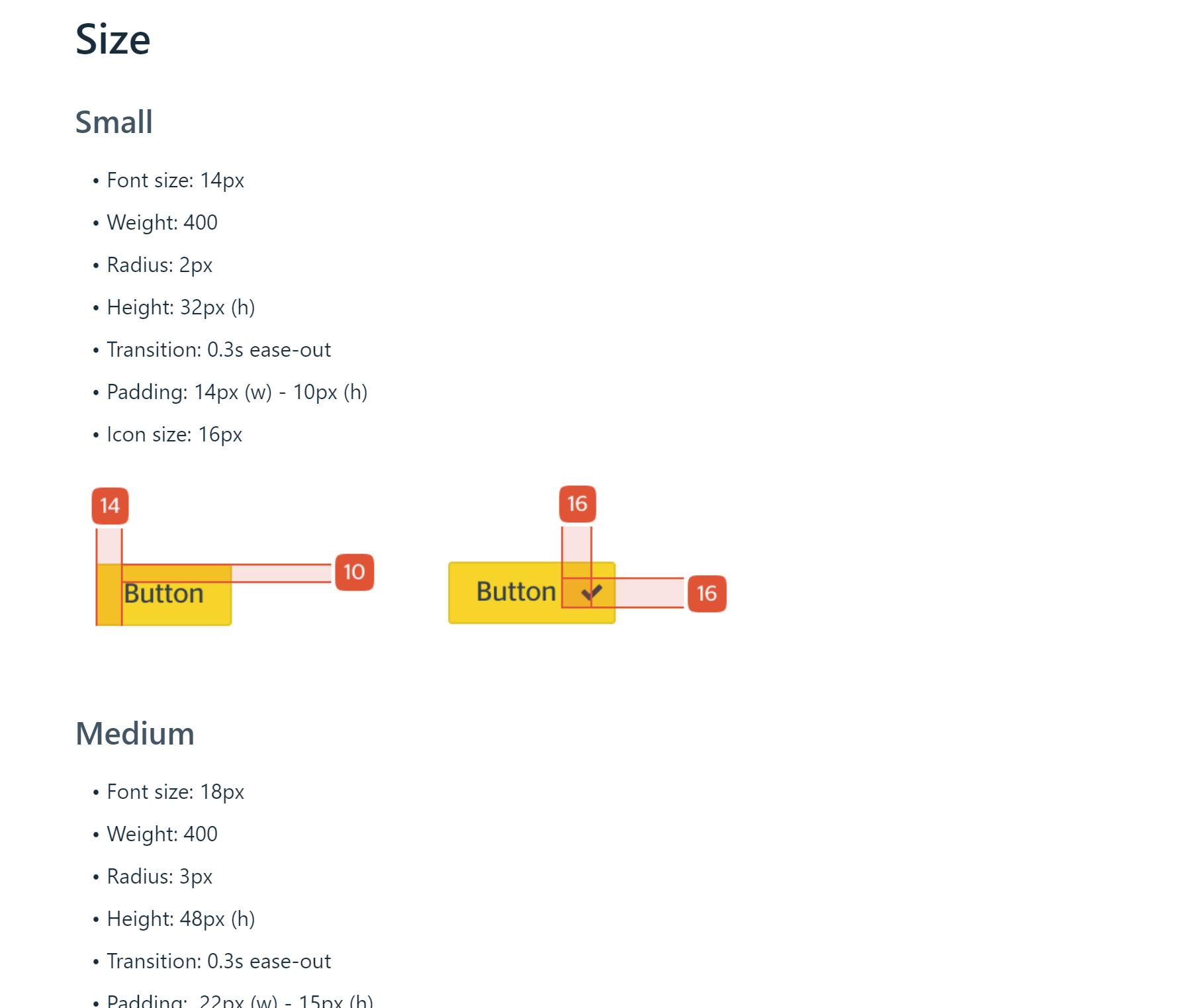
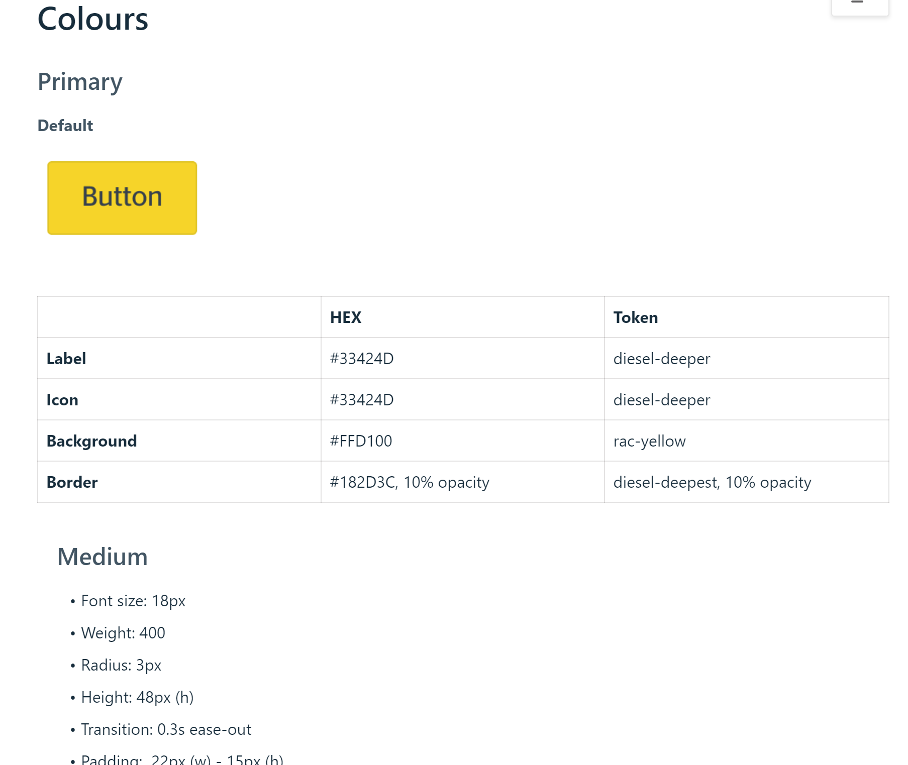
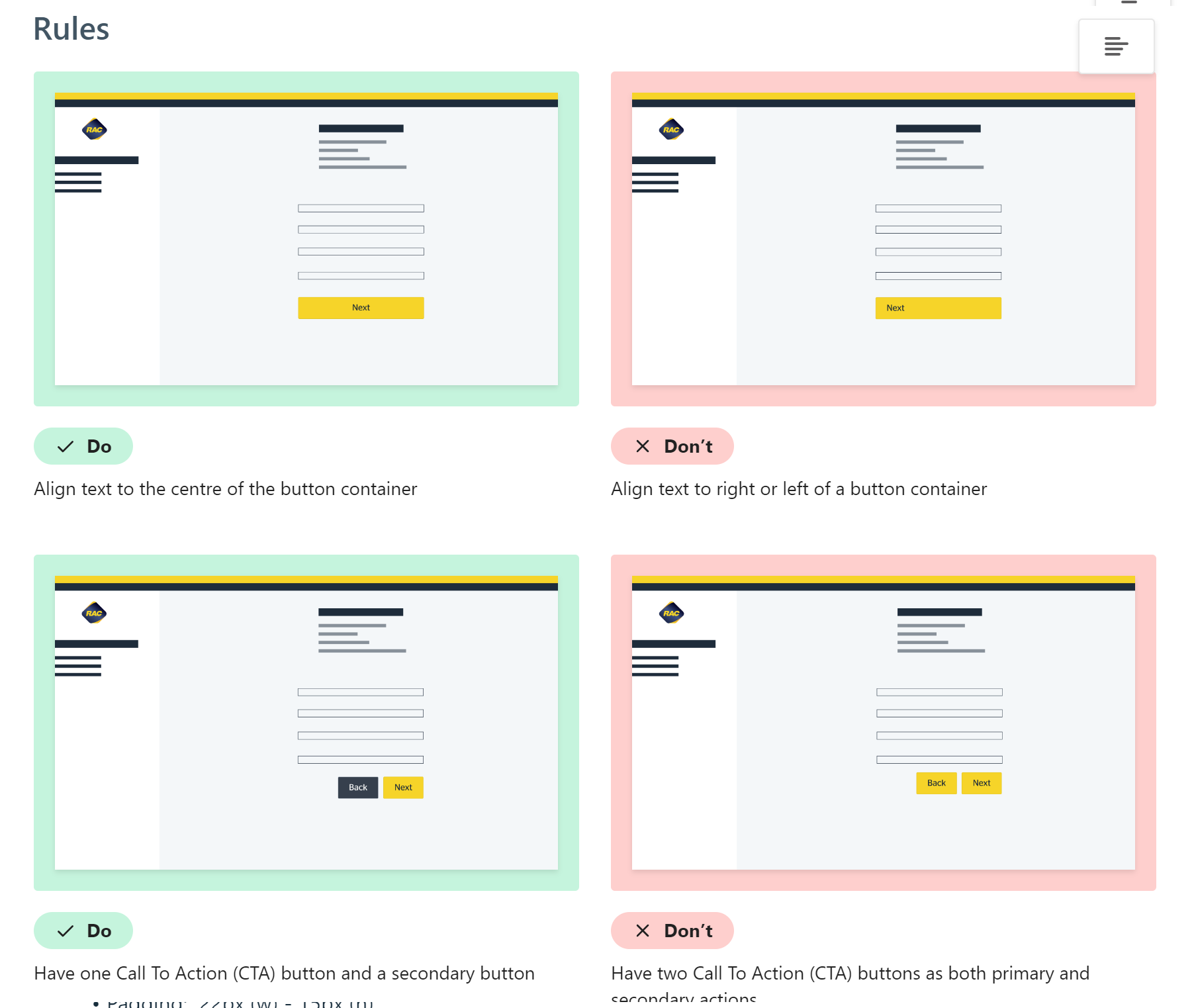
Designers were struggling to understand the RAC design eco-system
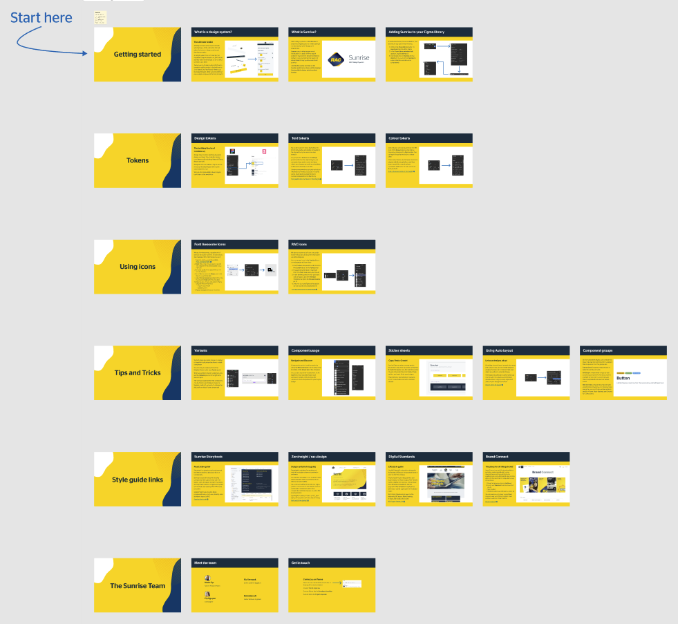
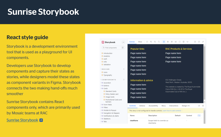
In DesignOps at RAC, we seized an opportunity to enhance designer onboarding. Newcomers often struggle with our design system and repositories like Brand, Figma, Storybook, Zeroheight, and Git.
I researched successful design systems for insights into designer onboarding. A common theme emerged: mature design systems used comprehensive onboarding, providing valuable context and team-specific connections.
Working with the design system's Product Owner and Delivery Lead, I led the creation of informative Figma onboarding slides. These curated slides empower new designers to grasp our system and navigate the RAC design ecosystem confidently. This holistic approach enhances their ability to integrate seamlessly into RAC's vibrant design landscape.
Accessiblilty improvements and and inclusive design principals for the design system
I am a key team member of the With, Not For Project. This project explores how RAC might co-create and embed inclusive design practices across our design process. We want to ensure that our products, services and experiences are not only accessible but create a greater sense of belonging for Western Australians. This includes members and the community, but also our people in their employee experience.
As a person living with an invisible disability (ASD) who has a passion for accessible and inclusive design, I was an Accessibility Expert and a point of contact for designers across RAC to ask questions about W3C guidelines, screen readers and WCAG minimum colour contrast standards. I keep across accessible design issues by consuming NNg articles, W3C guidelines and more.
We recently revised our React components to resolve accessible issues that were raised from an accessible audit by Vision Australia
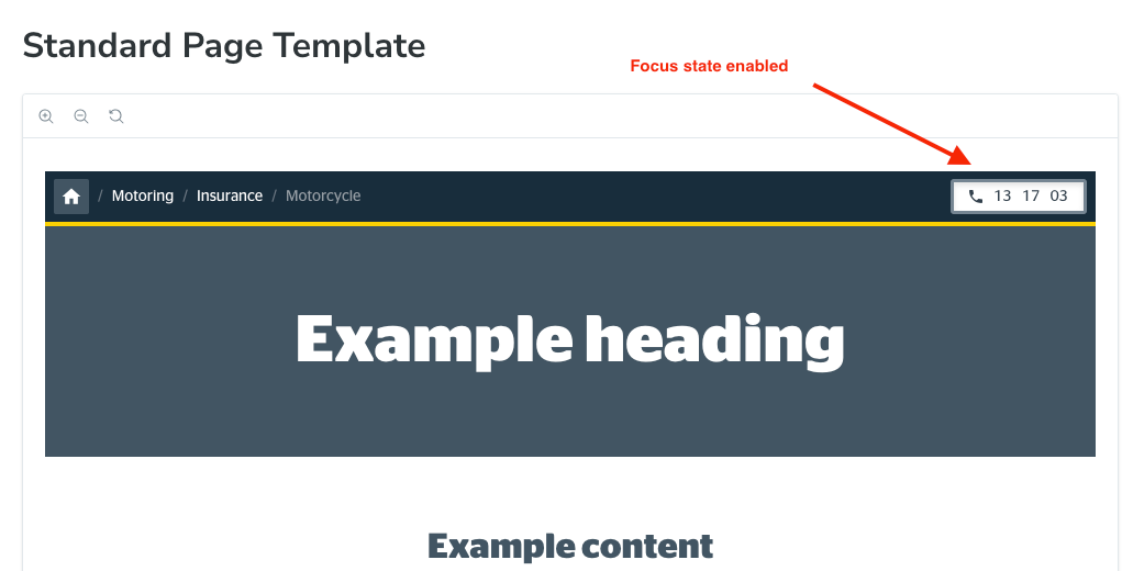
- The phone number button had a barely perceptible drop shadow focus state that failed an AA colour contrast check
- The aria-label in the phone number button didn't provide enough context for the screen reader to announce the phone number correctly. It simply said the numbers. Users were confused as to the context of the number being announced ('Is it a phone number? Is the total in my cart?')
- The home button icon would also disappear on keyboard focus.
- Placeholder text failed an AA colour contrast check
We resolved the above by:
This improved our Siteimprove accessibility score by 23% in our React apps, which took the total accessible score up to 84%
- Override the default MUI styling for the tertiary button to create a focus state that passed an AA colour contrast check
- Changed the aria-label to 'call us on 13 17 24'
- Changed to keyboard focus state for the home icon to diesel-deepest so it would be visible in all states
- Created a new colour token for placeholder text called 'subtleGreyText'
This improved our Siteimprove accessibility score by 23% in our React apps, which took the total accessible score up to 84%
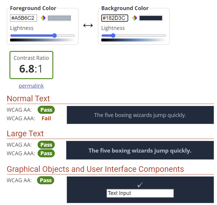

I am currently working on the digital accessibility guidelines for designers and I'm creating an accessible checklist for designers when they make new components and patterns. Also on the horizon is an accessibility audit of all components in the Surnise Design System and from there I will create a strategy around how to improve accessibility of these components.
Creating advanced Figma components for better usability
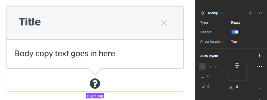
A number of foundational Sunrise Figma components in the Design System had minimal functionality for prototyping. Some components didn't have props for all states, auto-layout or even have options for different frameworks and breakpoints! (e.g. MUI vs Bootstrap). About 20% of our design system components had these issues, so I set out to create new advanced Figma components for the design system.
I started creating case studies of the coded components that were built in React and Sitecore to understand what was the current functionality of these components. I then spent hours crafting and testing responsive components in a branch in Figma, playing with Auto-layout and ensuring that the component included all states and breakpoints. I created component props with booleans, text, variants and nested instances.
I merged these new component branches to the main Sunrise Figma file without issues. Designers across RAC found these components more comprehensive and there was a 54% uptake in inserts and instances of these re-designed components.



- A faster, leaner design system that empowers it’s users to build products for RAC effiecently
- 70% reduction of total components, making finding the component you need easier
- Increased relationships between UX and Devs
- Happy system users
- Increase in the SUS score by 56%
- Increase trust in the design system as a source of truth by designers
- Increase traffic to Zeroheight across all teams
- Improved accessibility in the Sunrise Design System
Results and
Achievements
Achievements
I went into this role with a growth mindset, with every roadblock and obsolete component becoming an exciting challenge to tackle.
I learnt about code frameworks, systems thinking and product design and management. I increased my communication skills and worked hard to understand our code challenges.
I learnt about code frameworks, systems thinking and product design and management. I increased my communication skills and worked hard to understand our code challenges.
Conclusion
